Prompt
The Lunar Elixir is a new premium sake with the essence of the pearly moon. With a smooth, refreshing and delicate taste, the Lunar Elixir is a reconnection to heavenly delights.
At least that’s the dream. In this case study, the Fathom team created a new secondary package that encapsulates this idea for the Lunar Elixir sake. The goal is to elevate the brand story and help translate the digital marketing to the physical package.
Mood board
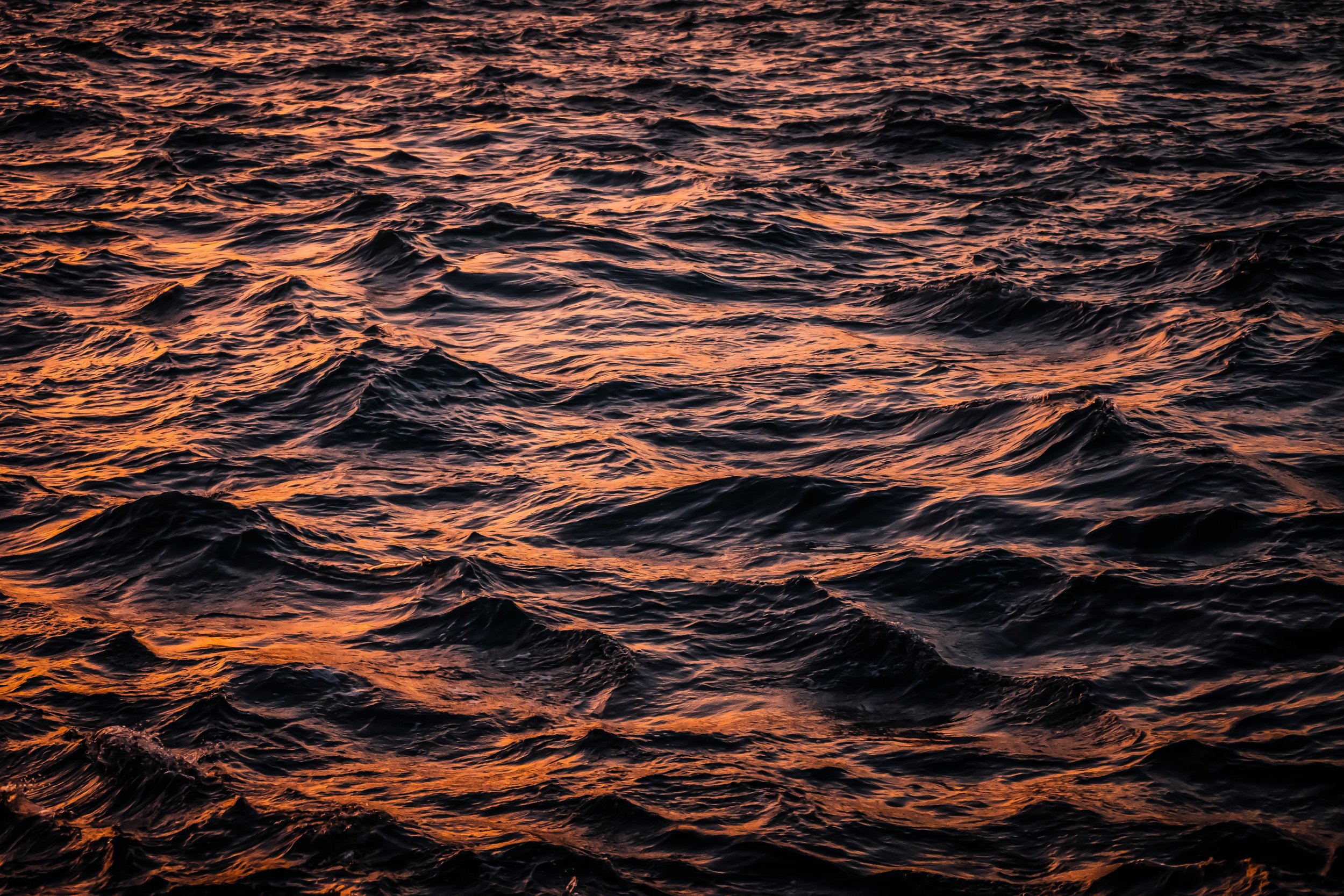
The branding stems from a calm ocean night, clear night sky, and a bright full moon. Tranquility, simplicity, and harmony are the core of the brand’s mood board. Though this description is a dream, we can recreate this feeling in the actual design.
Design process
Reviewing this mood board, I focused on clean, simple designs and I decided that the moon itself should be a main focus of the package. The secondary box would also be made with different layered materials. The contrast in material gives a rich luxury feeling to the whole design due to the mixture of textures. And because of this, I kept graphics on the box minimal to allow those elements to shine, as well as for convenient construction. A range of mock ups, both small and to scale, were made to see how proportion and placement felt. A final, more refined laser cut version was built to get a real taste of the dream concept.
With the moon graphic element already standing out in the design, adding any holographic affect to the moon itself would only further enhance its uniqueness. The real decision was, what Fathom Effect works best for the story?
Fathom Designer has a catalog of effects, and this was the starting point for choosing one. Eggcrate and Perlinescent were tested first due to how fluid they appeared, but they didn’t feel quite right. Through experimentation with the Fathom tech team, a slew of new effects were created based on textures. One of which fit very well with the intended brand, with a watery shimmer that moves with the user’s perspective—the Droplet Effect. Take a peak for yourself.
Digital marketing
Alongside the early mockups of the box, the digital marketing was being finished. The gradual swoosh of water movement in the design was an effective way in dividing the ad into a marketing/grounding space and dreamy world building. The upper section has details of the dream scene. Paired with the animated moving Fathom Effect, the digital poster reaches out and embraces the viewer. And thus, the dream is complete.
Seen live at LuxePack


